
Short Answer
Overview
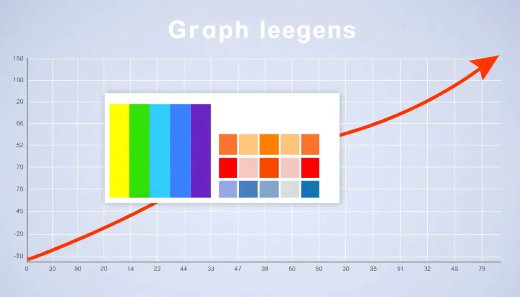
A legend on a graph is a visual guide that identifies and explains the symbols, colors, patterns, or line styles used to represent different data series or categories within the graph. It enables viewers to understand what each graphical element corresponds to without ambiguity. Legends are commonly found in various types of graphs including bar charts, line charts, pie charts, scatter plots, and more. Their primary function is to improve readability and clarity by providing a reference that links visual cues to the data they represent.
Detailed Explanation
Graphs often use multiple data series or categories that are distinguished by different visual attributes such as color, shape, or texture. Without a legend, interpreting these distinctions can be challenging or impossible. The legend typically appears as a boxed area adjacent to the graph and contains small samples of the graphical styles used (such as colored lines or shapes) alongside descriptive labels. These labels identify what each style represents, such as different variables, groups, time periods, or measurement units.
Legends can vary in complexity depending on the data and the graph type. In simple graphs with only two or three data series, the legend might be brief and straightforward. In complex charts with many categories or intricate visual coding, legends become more detailed and sometimes interactive, especially in digital formats.
How It Works
The creation of a legend involves associating each distinct visual element in the graph with a descriptive label. For example, if a line graph uses blue, red, and green lines to represent three different products’ sales over time, the legend will show a small blue line labeled “Product A,” a red line labeled “Product B,” and a green line labeled “Product C.” Viewers can then match the colors in the graph to the corresponding products using the legend.
In dynamic or interactive graphs, legends may also allow users to toggle the visibility of certain data sets or highlight specific categories for better focus. This enhances the graph’s usability and makes complex data easier to comprehend.
Examples
- Bar Chart: A bar chart displaying sales data for different regions might use different colored bars for each region. The legend would show colored squares with the name of each region next to them.
- Pie Chart: Each slice of the pie chart represents a category, differentiated by color or pattern. The legend lists each category alongside a sample of the corresponding color or pattern.
- Line Graph: Multiple lines represent different data trends over time, each with a distinct color or style. The legend identifies each line with the related variable.
Why It Matters
Legends are crucial for effective data communication. Without a legend, the viewer may misinterpret the graph or fail to understand its meaning altogether. They provide context and clarity, making the graph accessible to a broader audience, including those unfamiliar with the data set. By explaining the visual coding, legends ensure that the graph’s message is accurately conveyed and understood.
Common Misconceptions
Misconception: The legend is optional and only decorative.
Correction: While sometimes overlooked, the legend serves a functional and essential role in explaining the graph’s visual elements, making it critical for comprehension.
Misconception: Legends are only needed when colors are used.
Correction: Legends are necessary whenever multiple data series or categories are represented by any distinct visual cues, including patterns, shapes, or line styles, not just colors.
Pros and Cons
Comparison Table
| Aspect | Legend on a Graph | Alternative/Related Topic: Data Labels |
|---|---|---|
| Meaning | A guide explaining the symbols, colors, or patterns used in the graph. | Direct annotations placed on data points within the graph itself. |
| Purpose | Clarify which visual elements correspond to which categories or variables. | Provide exact values or categories next to specific data points. |
| Placement | Usually outside or adjacent to the graph area. | Inside the graph, near the relevant data points. |
| Use Case | When multiple data series or categories exist needing explanation. | When precision or specific data point information is necessary. |
Decision Checklist
- Use this if: Your graph includes multiple data series or categories distinguished by visual styles.
- Avoid this if: The graph is very simple with only one data series or the visual distinctions are self-explanatory.
- Check this first: Whether the graph’s visual elements need explanation to be clearly understood by the target audience.
What is the easiest way to understand a legend on a graph?
The easiest way to understand a legend on a graph is to view it as a key or map that links the colors, shapes, or patterns seen in the graph to their corresponding categories or variables. By matching the visual cues in the graph to the descriptions in the legend, viewers can quickly interpret what the data represents.
FAQ
What is the primary purpose of a legend on a graph?
The primary purpose of a legend is to explain the meaning of different visual elements such as colors, shapes, or patterns used in a graph, enabling viewers to understand the data representation correctly.
Can a graph function without a legend?
A graph can function without a legend if it contains only one data series or if the visual distinctions are self-explanatory, but for multiple data series, a legend is generally essential for clarity.
Where is a legend usually located on a graph?
A legend is typically positioned adjacent to the graph, often in the top, bottom, or side margins, to maintain clarity without obstructing the data visualization itself.


Leave a Reply